
Google is always striving hard to offer the best web experience to users across all devices. Towards that end, they are rolling out two algorithm changes to mobile searches in early January 2017. That’s no wonder, as the Big G (Google) has always kept usability at the core of all their product changes.
Google’s announcement in late August this year to crack down on disruptive interstitials only reinforces their resolve to make the web a better place for the web users. This imminent algorithmic change by the search engine early next year will have drastic repercussions on several businesses.
If you are a website owner or a business with a major chunk of the revenue sourced from advertisements, it’s time to restructure your advertising strategies. But worry not! This article covers all the necessary information to help you easily steer through this change; right from what the new change demands and how to equip yourself for it!
Changes in Mobile Search Results
In 2014, Google added a “mobile-friendly” tag on all the websites that were optimized for mobile search results. Those websites that required no zooming or horizontal scrolling to read the text and had their hyperlinks spaced sufficiently to avoid potential mistapping received this label.
But two years down the line, Google discovered that 85% of the websites are eligible for their mobile-friendly label and decided to abolish that. Now the search engine giant is all set to replace it with a search engine ranking criteria based on the mobile-friendliness of websites. Once this algorithm rolls out on January 10, 2017, the rankings of all the websites that display pop-ups (or Interstitials as Google calls it) on mobile devices will take a hit.
Google’s official announcement says that “Pages that show intrusive interstitials provide a poorer experience to users than other pages where content is immediately accessible. This can be problematic on mobile devices where screens are often smaller.”
But it is rest assured that the new algorithmic change won’t treat all the pop-ups the same or intrusive. The search engine has surely set certain criteria to check which ones are disruptive and which ones are not. For instance, pop-ups are legally required for certain websites that impose age restrictions on their visitors. Unless a pop-up is displayed such websites cannot verify their visitor’s age. So such pop-ups won’t be seen intrusive by Google nor will they affect the rankings. Login screens and large banners that can be easily dismissed are also excluded from the list of disruptive interstitials.
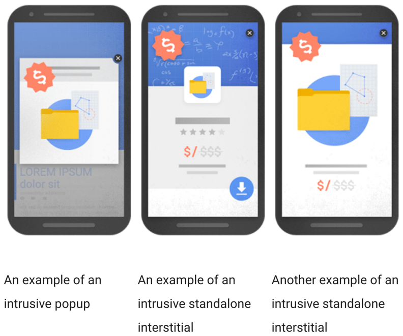
As per Google’s official announcement, these are the interstitials that the search engine thinks will affect the user experience,
- “Showing a popup that covers the main content, either immediately after the user navigates to a page from the search results, or while they are looking through the page.
- Displaying a standalone interstitial that the user has to dismiss before accessing the main content.
- Using a layout where the above-the-fold portion of the page appears similar to a standalone interstitial, but the original content has been inlined underneath the fold.”
These are the images included in the official statement as examples of intrusive interstitials,
How to accommodate this change as a marketer?
Mashable’s writer indicates that “Many websites rely on this traffic [Google search engine] combined with display advertising — sometimes in the form of pop-ups or interstitials — to remain in business.” Such websites (as pointed out by Mashable) that depend extensively on these disruptive mobile pop-up ads for revenue will be the most badly affected ones by this roll out. Obviously, these companies are now caught in a dilemma to choose between “ranking” and “revenue”.
According to a review of the internet trends analysis in 2015 (by Dave Chaffey at Smartinsights.com) “[the] mobile digital media time in the US [is] significantly higher at 51% compared to desktop (42%).” It goes without saying that such businesses relying heavily on Google for their organic search traffic will be devastated with this forthcoming change.
Marcus Andrews, Senior Product Marketing Manager at HubSpot has a valuable advice to all marketers. He urges them to re-optimize the mobile versions of their websites ASAP before the new algorithm takes effect. It is definitely tedious to restructure a business model, but it is unavoidable and well worth the effort. Andrews goes on to say that the companies that are greatly dependent on advertisements for increasing their profits must discover techniques to generate revenue without disturbing the mobile experience of the users.
As we know, Google is always committed to improving the web usability for the internet users. They make no compromise in offering the best web user experience. In order to achieve that, the search engine is constantly scouring the web for any devious techniques being employed by marketers to increase traffic. When it is convinced that the user experience is being compromised by such wily techniques, they come out with a corrective step to restore or improve the web experience!
Such remedial steps pave the way for the marketers to shift their focus more on the users – both in terms of what’s being offered to them as well as the overall web experience they receive! This change in focus towards users is dubbed as “forcing function” by HubSpot’s Product Development Director, Nicholas Holland. These algorithmic changes by Google will force the marketers to earnestly evaluate the rate at which mobile devices are taking over the internet and its obvious impacts on their businesses strategies.
These remedial measures by Google are massive warnings to those marketers who offer inferior web experience to their audience. Particularly to those businesses that are unaware of what superior web user experience is all about! These interventions by the search engine compel such businesses to consider other strategies to make a profit.
Wondering what those alternate profit strategies are?
First and foremost, get rid of all your existing pop-ups that you are running on your websites.
Inbound marketers are perpetually striving hard to drive targeted audience to their websites. That’s awesome! But in this traffic driving pursuit, they quite often end up using interstitials or intrusive pop-ups on their sites. This can, in fact, prove counter-productive and drive your audience away from your sites. Such interstitials can create a bad user experience by obstructing the content or restricting it.
So, as a marketer, your primary goal should be to provide impeccable content to attract your target audience. Incorporate Calls-To-Actions and embedded opt-in forms in your content to generate revenue and leads. That’s the best alternative to disruptive pop-ups!
By getting rid of these interstitials from your website, you are actually accomplishing two crucial SEO benefits. First, you are providing exactly what your prospects are looking for – thereby improving your site’s position in the search engine results pages. Secondly, by removing those intrusive interstitials, you are securing your site from being penalized by the impending algorithm change early next year.
This video recommends some additional alternatives to intrusive interstitials
How to equip yourself for the change?
So here’s a rundown on how you can gear up (as a marketer) for the forthcoming rollout!
If you are seeing this imminent algorithmic change by Google as a potential bogey that’s going to devastate your business, then please don’t! As discussed earlier, this change is actually opening up new avenues for marketers to apply their skills in improving their overall web traffic as well as effectively roping in those huge chunks of additional prospects accessing the web on their mobile devices.
Here are some of the steps that you can take to stay secured from the upcoming update!
- Remove all pop-ups from your website – unless they are legally required. The interstitials that won’t be treated as disruptive are the ones used for verifying the age, logging in, and for informing your users that your website uses cookies.
- If you have relied heavily on pop-up ads until now for generating profits from your site, then explore alternate methods to generate revenue.
- Discover methods to generate profit without compromising the user experience. At the same time, make sure your website is also tailored to the needs of mobile devices. These are by far the two vital SEO signals that determine better rankings of your web pages in the search results.
- Provide valuable content on your website that is capable of resolving a query or offer a solution to your reader. Your users will then soon see you as a subject matter expert. Regularly offering great content on your website will not only instill trust and confidence in your existing prospects but also bring in more traffic that you can easily convert into leads or sales – without being overly intrusive!
How to make your website more mobile friendly?
Ok, you will get rid of those intrusive interstitials to gear up for the rollout. That’s terrific! But it might be also useful to know how to make your website totally mobile-friendly. Here are some useful that you can incorporate into your website design to offer the best user experience for your prospects on their mobile devices.
1. Analyze Mobile Data: Check your analytics tool to find out what type of devices and browsers are being used to access your website. Also, learn how your users are interacting with your site on their devices. These are vital information that’ll help you optimize your website for better mobile experience.
2. Mobile Configuration: You can optimize your website for mobile devices using three ways: Responsive Web Design (RWD), Separate URLS or Dynamic Serving. As RWD is Google’s most preferred mobile configuration, it is highly advised to tailor your website using RWD.
3. Take End User’s Perspective: Before designing your website for mobile devices, step into your target user’s shoes to discover what features and content they would like to see on the mobile version of your site. This will help you increase the user engagement while they access your site on their mobile device.
4. Keep Content Succinct: To make your site more user-friendly and readable on mobile devices, only display what’s really needed. Keep the content short and brief. Create shorter versions of actual content for your mobile version to create a rich user experience for your readers.
5. Offer Easy Navigation: Providing easy navigation for the site on your mobile devices is paramount!The menus and icons must be easy to locate to help users easily find their way through your site. Also make sure that the menu list is shorter, as a huge list can make the navigation cumbersome on mobile devices.
Additionally, to offer the best user experience on mobile devices, you must also provide an easy to find a search box on the site. Offer a video format that’s compatible across all mobile devices. Keep the mobile version as lightweight as possible for better responsiveness. Keep text inputs to the minimum, make your site visually interactive and last but not the least, test out your mobile version thoroughly before making it live!
If you’re thinking of personalizing the experience of your visitors, try FoxMetrics for free and Subscribe to our Newsletter get recent updates and news.