
In older times, only tech people could design dashboards. We can say with certainty that those days are over. With the rise of technology in recent times, designing has become easier than ever. Even so, it takes a lot of planning and skills to come up with a captivating design. But once you have a firm grasp on the major principles involved, nothing comes in your way.
This article discusses the 5 key principles of designing dashboards. These principles ensure flawless and methodical dashboard designing. Once you start implementing them, your dashboard design will become much more productive.
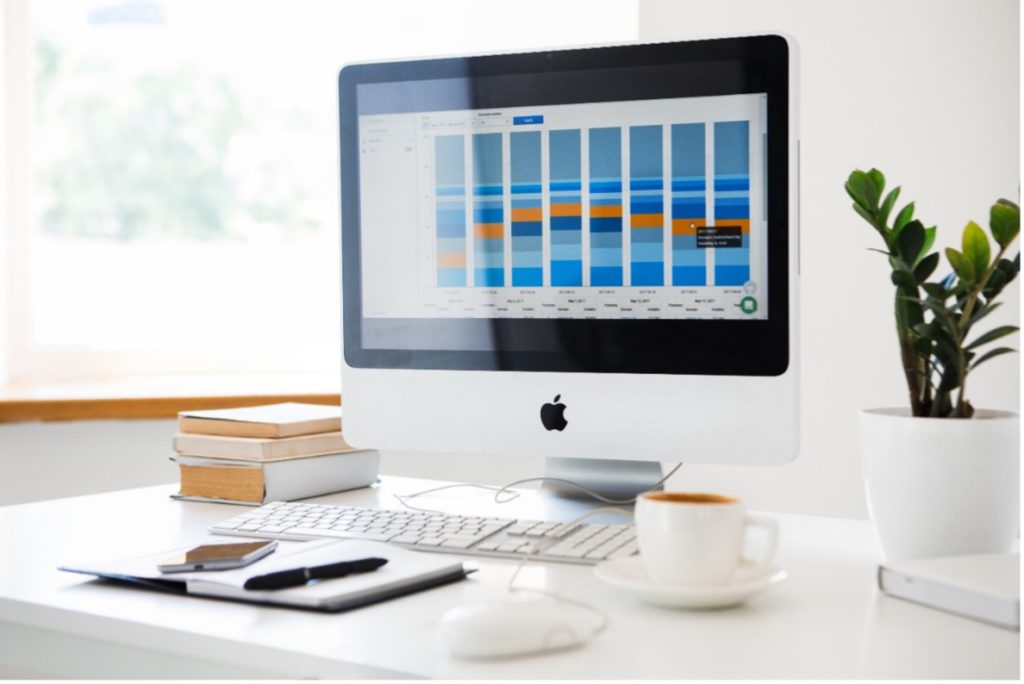
What is a dashboard?
A dashboard is a data analysis tool that provides a centralized overview of the data. They do this by tracking progress and monitoring analytics. This summarizes the data into business-driven insights in a thorough, and concise manner.
The goal of dashboards is to provide an extensive outline of the organizational data. This data includes progress tracking, goals forecasting, or currently ongoing process. Dashboards help in various problems, including web analytics, mobile analytics, and marketing analytics. They also have a dashboard for eCommerce companies with a way to keep their data organized.
Importance of Dashboards
Dashboards are essential and robust in presenting data-based intelligence using data visualization techniques. They display relevant, actionable data and track stats and key performance indicators (KPIs). This overview of essential data is the key to make informed data-driven decisions.
Dashboards are a mainstay in modern enterprise-class data analysis tools. There is a good reason for this. Business personnel of all skill levels can use these dashboards. This ease helps them understand the operations of their organization.
Dashboards use quantifiable facts and figures as actionable data. Dashboards also visualize this data as percentages, graphs, charts, and forecasts. The organization manages its operations and evaluates its performance. The data viewed in this manner shortens the learning curve and time to generate insights. This allows business executives to introspect and act on findings immediately.
5 Key Principles of Dashboard Design
Designing dashboards is getting competitive with every passing minute. It’s quite critical nowadays to design comprehensive, concise, and interactive dashboards.
Here are the 5 key principles that you should adhere to ensure the best dashboard design for you:
1. Know your Audience

There are lots of factors to manage when designing effective dashboards. Among the most important principles is that you should remember your audience. You need to know who is going to use the dashboard.
To do this, you need to think like your audience. It is very important to know under what conditions will the users view the data. Is the dashboard viewed at the office desk? Or is it displayed to a much larger audience with projectors and screens? It is also essential to know how the information is being displayed.
Despite all that, you should never forget why you are making the dashboard in the first place. You are doing this because you want to present data. This will simplify the decision-making process for a specific audience. If the audience is more traditional, you follow the less ‘fancy’ design and find the better one.
It is important to ensure that the dashboard is not too technical for the audience. Otherwise, they would waste so much of their time that they should have saved with the dashboard. The data analysis displayed on the dashboard should provide added value. For example, a user should not do manual calculations himself to get the information. Instead, the dashboard should display everything he needs on the chart.
2. Choose the Right KPIs
Different kinds of dashboards have different use cases. Those include areas like web analytics, eCommerce store management, and many more. To make an effective and efficient dashboard, KPIs are an important factor. We must understand the concept of Key Performance Indicators (KPI). We should also know how they drive this system. We can leverage KPIs to analyze and visualize data for more desirable dashboards.
KPIs are the factors or parameters that impact the goals of an organization. Organizations can measure, track, and forecast goals through their KPIs. This helps them track their goals and improves their operational efficiency. An example would be the marketing industry. Marketing analytics is essential to the organization to expand outreach and growth. For this, they have quantifiable goals (like the number of signups or visits to the company store).
This helps companies know if they are operating the right way or need improvements. These metrics visualize representations of relevant insights based on specific business use cases. Thus, KPIs can help shape your dashboard direction. You should have your ultimate goals set and your target audience considered. Then you can choose the best KPIs for convenience on your dashboard design.
3. Easy Navigation is the Key
While designing a user interface you should not go overboard with the design. This is because browsing, clicking, pulling, and drilling are complex user habits. An effective dashboard design requires little understanding and should be as self-explanatory as possible. Avoid looking at too many visualizations on the dashboard. Instead, tell the story using many dashboards. This makes each dashboard self-explanatory and increases appeal and efficiency.
Responsive layouts are one of the essential elements of design considerations. Responsive layout is a Content First technique with many ups and downs. The responsive layout helps keep things clean on all kinds of screens. The best method is to capture as many images, menus, buttons, and text as possible. You can also experiment and use zoom and drill-down capabilities instead. Make sure some of the navigation icons you use to make sense and label them if necessary.
The dashboard design should present the users with options in a clear and concise form. Irrelevant data can create a lot of confusion and disarray. You should have an idea of what options are not required and avoid using them in the dashboard design.

With modern data visualization tools, there are many ways to display over-the-top data. The different options should not overwhelm you enough to miss the goal of each dashboard design. Unique visualizations are valuable when used in a correct manner. They help to highlight movement and trends in data that do not stand out in the traditional format. Make sure your customers know their desired information.
4. Progressive Disclosure
Progressive disclosure is a popular data visualization and management technique. It eliminates confusion and captures the attention of the user. The menu allows users to find relevant information first. They can then choose to dive into the data to find more information as per their requirements. Thus, the dashboard is less cluttered without most functionality behind a single button. You can further optimize your dashboards by using filters. Filters allow users to focus on the relevant information subset. Filters also allow users to categorize and filter out unwanted information as needed.
Progressive disclosure is the best practice in dashboard design that reduces error rates. This technique improves efficiency and helps the users understand the dashboard. They are then able to use them for their benefit.
Benefits of using progressive disclosure on dashboards:
- It reduces consumer uncertainty and anxiety. It assures users that everything is working as intended.
- Customers see something instead of waiting (partial display of data).
- It provides customers with a clear expectation of the steps ahead. It also makes them aware of how to display information as they need.
5. Select the Right Dashboard
Different dashboard designs have different requirements, goals, KPIs, and limitations. An essential part of dashboard design is to conclude which type of dashboard suits you. You should make sure the page displays every key piece of information. Here are 4 basic types of dashboards for each major branch business-oriented activity:
- Strategic: A dashboard focused on overseeing long-term company strategies. It analyzes and benchmarks extensive critical trend-based information.
- Operational: A business intelligence tool for an overview of the organization. It tracks, measures, and manages processes or activities with less or more time.
- Analytical: These unique dashboards contain large streams of comprehensive data. These dashboards allow analysts to gather insights and improve the operations.
- Tactical: Dashboards with this information are well-suited for mid-management. They help to develop development strategies based on strengths and weaknesses within departments.
You should design your dashboard in a way that caters to the needs of your specific users. Information is valuable only when it can benefit the users. The customer must be able to use the information in their business strategies and goals. Make sure you can identify important information. Also, separate the vital information from the irrelevant one to maximize customer productivity. This will help you create comprehensive, concise, and effective dashboards.
Dashboards are integral parts of data analysis for organizations. They round up all the facts and figures into actionable and readable data. It is critical to know that different dashboards have different goals and requirements. It is crucial to follow these fundamental practices to get the desirable results:
- Put yourself in the shoes of the users and analyze what they need from the dashboard.
- Identify which measurements are best for the dashboard and design.
- Make the dashboard easy and interactive. Interactive dashboards will capture the undivided attention of the user.
- Apply progressive disclosure to your dashboard design. The technique stops the jumbling of data and makes all information available.
- Make sure to know the purpose of the dashboard. Select the right kind of dashboard to achieve desired results.