
Trying to navigate a website without a well-defined structure is like making your way through a complex maze. It’s highly frustrating and not the ideal experience that users are hoping for. If your website navigation is unclear, visitors may decide to click the “Back” button to leave.
This article discusses website navigation best practices and trends to make your site function better.
But first, let’s look at why web navigation is essential.
What is Website Navigation, and Why does it Matter So Much?
Website navigation is the internal link architecture of your website. It is how each link within your site connects your pages.
Many website owners believe that their job is done once they get visitors to their site, but that’s not the case. The average web surfer spends less than 20 seconds on a site before moving on, and poor navigation is one reason they leave.
Without proper navigation, visitors to your site won’t be able to find products, pages, contact information, or any other thing they’re looking for.
Today’s users aren’t just looking for products or content. They want convenience and personalization, and having a good navigation structure is the proper start.
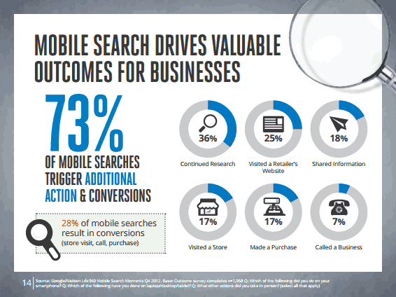
Additionally, having excellent website navigation enhances SEO performance. Search engines use website navigation to identify and index new pages. The links help search engines to understand the context of a specific page and its relationship with other pages.
So when done right, good website navigation will lead to more conversion and greater visibility in searches. Here are some website navigation best practices to keep in mind.

1. Your Site Navigation Must Be 100% Responsive On Mobile Devices
Over 90 percent of the internet population surf online with mobile devices at one point or the other. As such, having a mobile responsive site is a must to improve your conversion rate.
If your theme doesn’t render properly on mobile, then consider changing it or customizing it. Ensure the navigation buttons are large enough for the human hand to press on.
You can also use responsive menus that collapse and expand when touched, slides, and other formats to simplify your navigation structure.
Having a mobile-first website will also enhance your SERP on Google.
2. Visitors Should Always Come First
The essence of website navigation is to make it easier for your visitors to move around your site. It can be tempting to structure your navigation based on what you have in mind or what you like. But the most critical web navigation tip to keep in mind is always to put your users first.
What will your visitors like to see? Where would they want to go? Design your navigation based on the needs of your users.
3. Structure Your Navigation Based on Business Priorities
While keeping in mind your visitors’ needs, it’s also essential to funnel your visitors to the most critical pages on your website to ensure conversions and sales. Design your navigations so your visitors can easily find and navigate to relevant pages.
For instance, if you have a mobile app landing page, the “Download” button should be prominent so users can easily find it.

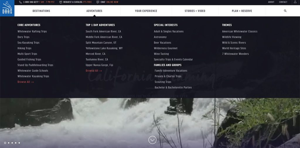
4. Avoid Long Menus
There’s always the temptation to jam-pack everything on the menu bar. After all, that would help visitors navigate faster, right? But that’s a wrong approach. It’s advisable to keep your menu options less than seven.
Asides from making your site simpler, this also helps in terms of SEO. Each menu on your homepage is a link, and search engines penalize sites for spamming their home pages with links. Having fewer menus will mean fewer links, which will enhance your site’s authority and boost your ranking.
Additionally, the name you give to each menu item should be user-friendly and précised. Stick to a single phrase style.
5. Include a Function Search Feature
The search feature allows users to find exactly what they’re looking for quickly. So if a visitor doesn’t understand how to navigate to a specific page, they can just type into the search box to find it.
Your search function must have additional features like similar suggestions, spelling error detection, and so on. Typically, people who run searches on websites are two times more likely to convert than those who don’t. IKEA and Airbnb are two excellent examples of sites that maximize their search function.

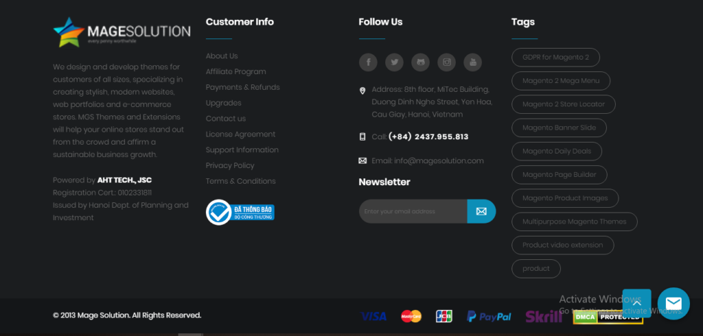
6. Don’t Forget Footers
Footers are an essential part of website navigation that can impact your site’s bounce rate and conversion. Users typically expect to find vital information like contact information, social media links, and others on a site’s footer.
What’s Next?
Leverage Web Analytics to Optimize Your Site’s Navigation
All you have done so far are based on guesses and general best practices. No two websites or audiences are the same. So to truly optimize your navigation, you have to find out how your visitors move around your site.
FoxMetrics web analytics tool allows you to achieve this. It empowers you to discover where your audience spends more time and how they navigate the site.
You may discover that people aren’t using the search bar because it’s not visible or that specific navigation links receive more clicks. This would allow you better structure your navigation for a more significant impact.